Website design is an important factor that glue up the visitor on the web page. A good web design may attract the viewer to look at your services but a foul design can surely scare away the visitor forever. So are you too desperate to scare away your visitors? If not then in this post I will tell you how to avoid scary designs in your website.
Actually a website designer can irritate a visitor by thousands of ways but still there are 5 common ways by which they commit this crime. The pit holes which you must avoid in your website design include:
- Inconsistent use of fonts & colors in website
- Highlighting text with improper color codes
- Marquee, Scrolling and Blinking Text on the landing page
- Unnecessary use of Flash and animated gif images to make it attractive
- Cluttered pages with confusing headlines
Inconsistent Use of Fonts & Colors in Website
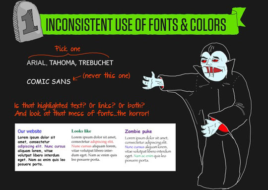
Fonts are the crucial factors that must be chosen wisely and if you are using improper font then you are simply SCARING your visitors.
Highlighting Text with Improper Color Codes
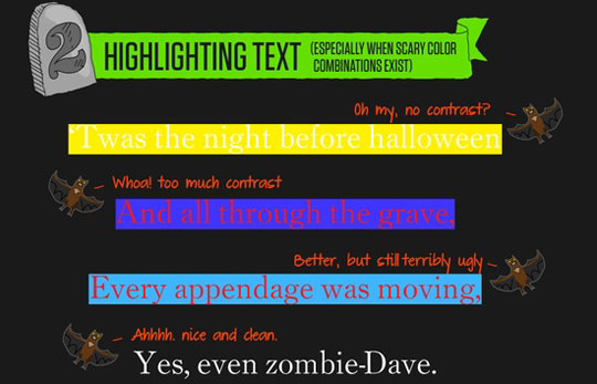
Just two things to say; Avoid highlighting and if it’s a must than use them with proper color combination and contrast ratio.
Marquee, Scrolling and Blinking Text on the Landing Page
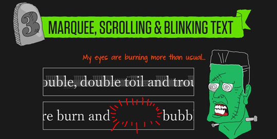
Blinking Text! Are they alive? Even if they are; stay away from them. They are good for nothing and better for blunders.
Unnecessary Use of Flash & Animated gif Images
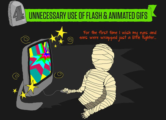
“You just won a Ferrari-Click here to acclaim”, “Pamela in your area-Chat now”; please make a knot that actually everyone hate those red blinking banners. So if you are planning to integrate flash and animated images on your webpage then do use them smartly.
Cluttered Pages with Confusing Headlines
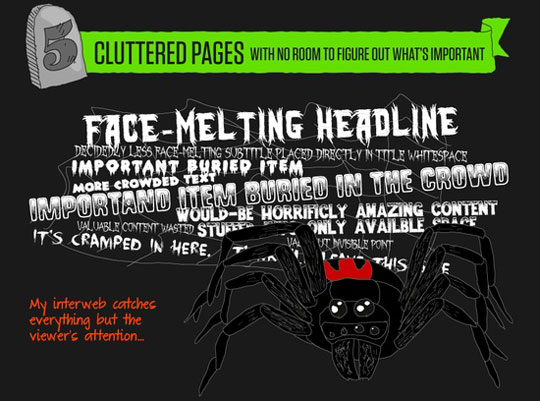
It is always advice to highlight the important headlines but it doesn’t mean that you make your every line a headline. It not only confuses the reader but also turn red alarm for the search engine crawlers.
Final Words
I hope that this post of mine will help you to design your website smartly and user-friendly. You can leave your feedback about my work in the comment section below. I will be happy to hear from you.
Stay Updated with Web Technology- Keep Visiting CSSChopper
Posted By: CSSChopper Team
Categories
Recent Posts
Popular Posts
- How to Choose a Reliable Offshore Development Partner?
- Transforming Web Development with HTMX’s Declarative Approach for Dynamic UIs
- Why Your Conversion Funnel Needs a Composable Commerce Solution?
- How to Outsource Web Development in 2025: Complete Guide
- What are the Top Web Development Trends for 2025?


