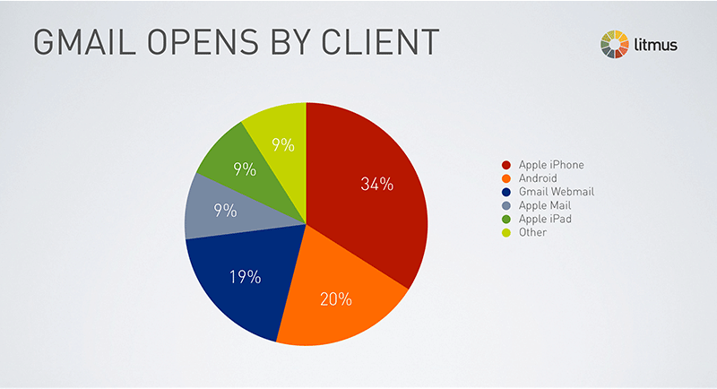
Responsive email designs are gaining popularity a lot these days and the number clearly justifies this statement: 47% of emails are opened on mobile devices. Yes, you read it right. Due to the growth in mobile device usage, it has become necessary to include responsive design in your email marketing efforts. That’s because when a newsletter will not render properly on a mobile device, the recipients will have higher chances to delete your mail or unsubscribe your newsletter.
 Having a responsive email design will be helpful in keeping you one step ahead in the email marketing game. In this post, we have provided all the useful insights related to responsive email design.
What is a Responsive Email Design?
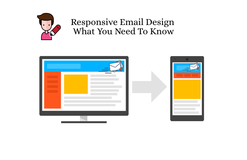
A responsive email is an email that will appear great on any device- whether it is a smartphone, tablet, or desktop. The email will adjust with screen resolutions, thus allowing subscribers to read emails with ease.
Responsive email designs will utilize CSS media queries to generate two distinct copies that will rely on the size of your user’s screen. Media queries will adapt to the email copy’s layout automatically.
 Best Practices to Adopt for Responsive Email Design
- Always choose a single column layout. Due to less shift and move, the reader can read the content without any inconvenience.
- Add your essential CTA or information above the fold. This will help you to make the content readily available for the readers without making them scroll down more to find information.
- Avoid the use of hyperlinks and specifically don’t clutter several links together
- Choose the right font size. For regular body text, the size needs to be 14-16px and headlines should be 22-24px. This will make the email copy clear across multiple devices.
- Create CTA that are easy to tap and contrasts with the background appropriately. Try to keep its size around 44*44px. When creating an email template, choose full width so as to provide good space for tapping a CTA button.
- Make use of small and responsive images and use alt-tags if in case the email client does not load images. This practice is good in terms of accessibility.
Importance of Responsive Email Design
As mentioned earlier, the majority of mail is opened on mobile devices. Furthermore, 75% of users will be more likely to click on the delete button if they aren’t able to read it properly on mobile phones. The absence of responsive design results in a lack of usability that forces readers to unsubscribe and mark the email as spam. In turn, this negatively affects the sender’s reputation and email deliverability.
If your email design is not responsive, the readers will face difficulty in reading the content of your email on a mobile device.
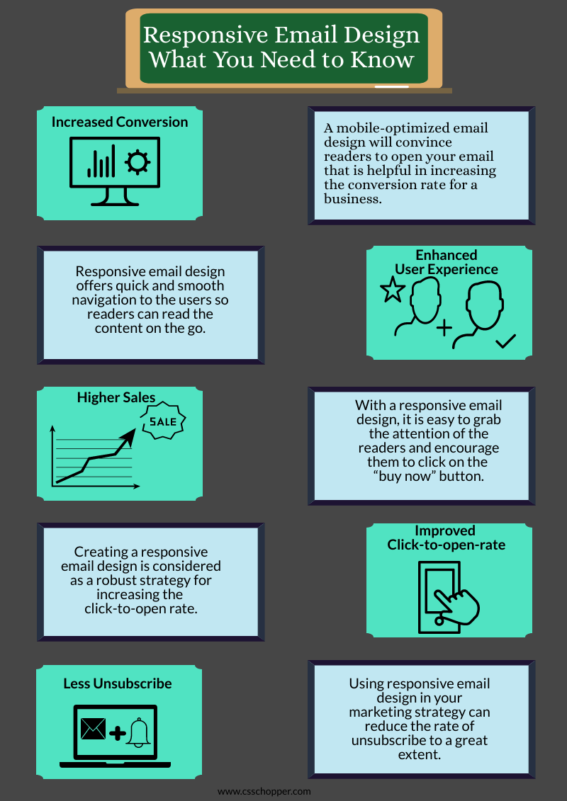
Following are some of the advantages of responsive email design:
Improved User Experience
By incorporating a responsive email design in your mail, readers can access it easily while on the go. This will provide them with smooth navigation without any need to zoom in or out to read the content of your email. Moreover, large CTAs clearly assist them where they should head towards initiating a purchase. If your email will look superb on the receiving end, then the readers will surely read the rest of your content.
Higher Conversion Rate
If your email design is optimized for mobile devices, then you don’t have to stress about the less conversion rate that happens because of non-responsive design. With an attractive and responsive email design, you can win the trust of the readers and they will quickly sign up with your service, thus increasing the overall conversion rate.
Boost Sales Performance
Once you become successful in capturing the attention of your readers, chances are they will click on the “buy now” button to make a purchase. Responsive emails render an amazing experience on all types of devices, building a positive image of your brand in the reader’s mind.
Better Click-to-Open Rate
Building a responsive email design is one of the most powerful strategies to increase email click-to-open rate. As per the study by MarketingProfs, it has been revealed that responsive emails have a 21% more click-to-open rate than non-responsive emails. For this particular reason, it is important to have a responsive email design.
Less Unsubscribe & Spam Complaint Rates
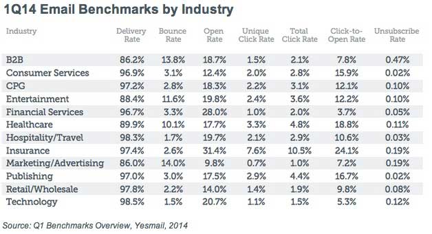
If an email does not look fine on mobile devices, the recipients will take no time to unsubscribe from your service. When your readers will not read the information properly with smart devices, they will mark your message as spam. With responsive email design, you can create a good impression thus, leading to low unsubscribe or complaint rates.
Final Notes
There is no denying the fact that responsive email design offers a lot of advantages to the business. Whether it is increasing conversion rate or monthly sales, its role is indispensable.
Today, PhotoShop designs are widely used to create responsive email templates. If you want to have one for your business, then you can choose CSSChopper. We have a talented team of web designers and developers who can convert your PSD into a responsive email template. Give us a call today!

 Best Practices to Adopt for Responsive Email Design