Typography is everywhere. Whether you see posters, brochures, logos, images, or websites that have text from smaller to a larger extent involves the utilization of typography.
Brands have to create their recognizable identities in this competitive business environment. Grabbing the attention of users becomes pivotal to conveying the brand message properly. For that to happen, a business should properly use typography as a powerful way to turn simple text into an impactful visual. Its skillful usage ultimately results in building brand recognition.
Typography’s strategic usage is key to making a brand. However, this whole process requires a significant investment of time, effort, and skills. Working with a custom website development company is a wise decision.
What is Typography?
In layman’s terms, web typography is a process of using different fonts on the web while looking for custom or eCommerce website development.
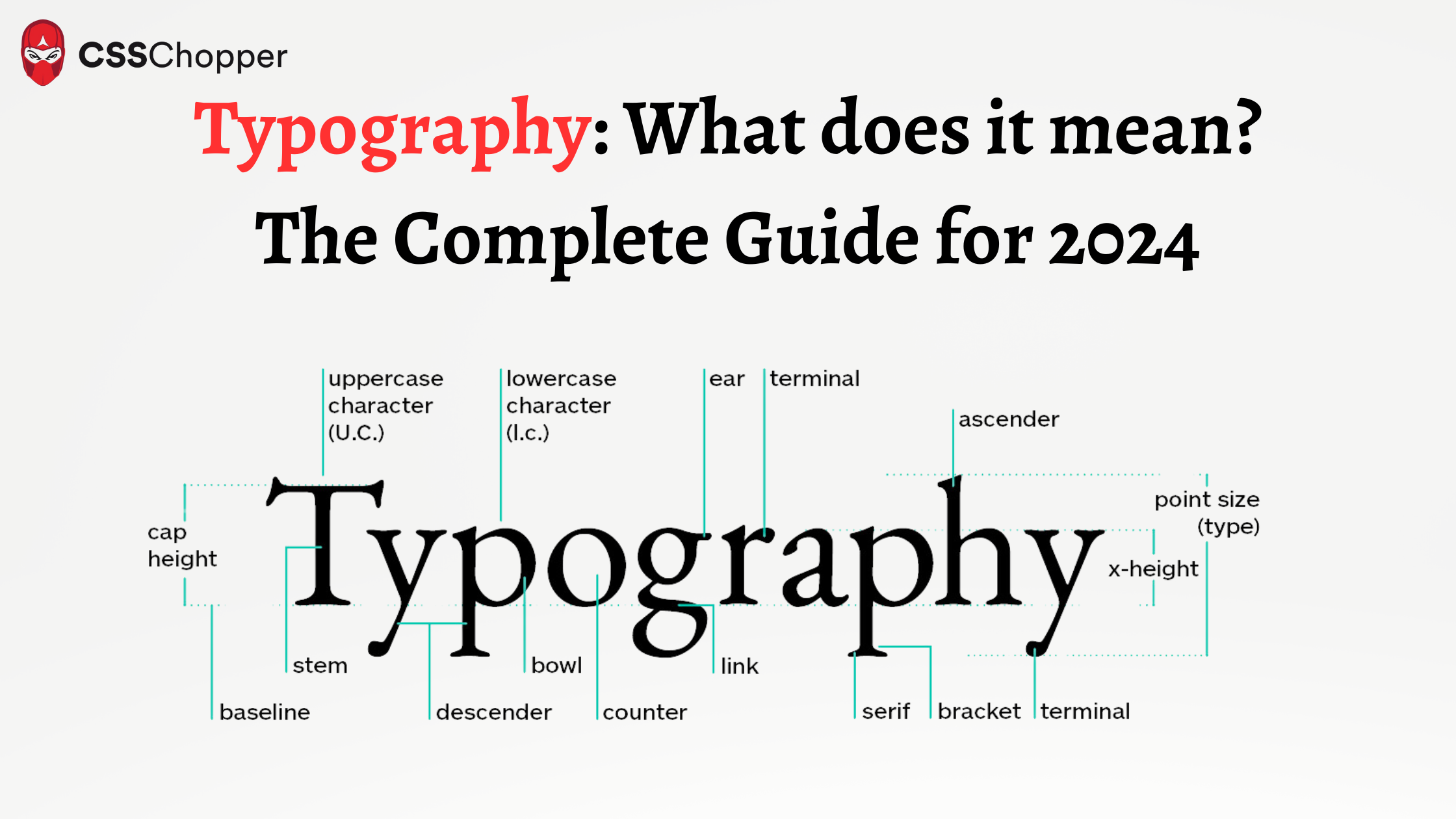
Typography is a technique of structuring letters and words in a way that improves the legibility, readability, and even navigation of a website. This helps a business to create an aesthetically pleasing interface for users. Simply put, Typography plays a vital role in giving life to the text.
All these elements play a vital role in providing a pleasant reading experience for users. Also, it is very helpful in making the difference between whether the users take an action or drop off from your website.
Typography in Website Design
Typography plays a vital role in web designing by enabling effective communication that enhances the visual aspect of the content. Pay focus on choosing the right fonts, size, spacing, and styles that are helpful in creating a strong hierarchy of the information. This makes it easier for the users to read and understand the content.
It role goes beyond that, as it directly impacts the user experience and engagement.
Role in User Experience
The typography used in website development significantly impacts the user experience of a website. This is because of the utilization of clear and well-organized text that is helpful in improving readability, which ensures that users can easily navigate and consume content. A web developer or designer must carefully consider typography for a seamless, unified user experience.
Responsive Typography
With the emergence of diverse screen sizes, responsive web design has gained paramount importance. This states that your website should work the same across different devices. Typography must adapt to diverse screen sizes and resolutions, maintaining optimal readability across various screen sizes. You can work with a responsive web developer to ensure a consistent and user-friendly experience on all devices.
Role of Typography in Custom Website Development
Typography in custom website development plays a crucial role in defining the online presence of a brand. You have to be wise in the selection of fonts, colors, and layouts to contribute to the aesthetics and reinforce brand identity.
1. Role in Custom Websites
It acts as a visual element that communicates the value of a brand and resonates with the target audience. Carefully curated fonts and layouts contribute to a distinctive online presence.
2. Enhancing Brand Identity
From the website to social media, the use of consistent fonts creates a cohesive and recognizable image of your business. This makes it easier for users to associate content with a specific brand.
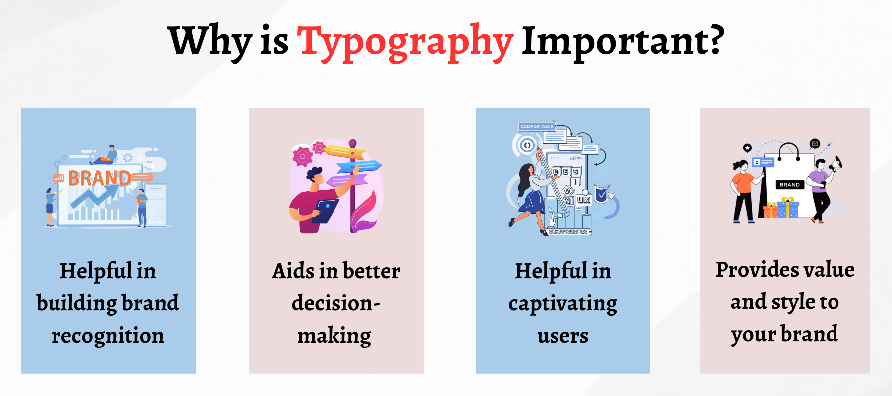
Why is Typography Important?
Typography is so much more important than choosing appealing fonts for your website; it is one of the most vital components of the user interface. A good typography will establish a strong visual hierarchy, providing a graphic balance to the website and setting up the overall tone. It is helpful in optimizing readability and accessibility by ensuring an excellent user experience.

Let’s delve a little deeper to get an understanding of the importance of typography in web development.
1. It Helps Build Brand Recognition
Good typography plays a vital role in building brand recognition. This enhances the aesthetics of your website by utilizing the right typeface that is associated with users
When it comes to building a strong user base, having a unique and consistent typography is a must.
2. Aids in Better Decision-Making
Good typography is not just helpful in building brand recognition, but it also influences decision-making. Typography has a profound effect on how users perceive information conveyed by the text.
Eye-catching fonts attain more attention from users than weak fonts because weak fonts do not reinforce the message of the text.
3. Helpful in Holding the Users
Good typography is helpful in holding the attention of the readers with an aesthetic appearance. Typography stands as a difference between someone staying on your website for one minute or an hour.
In making your website visually appealing and stimulating, typography played a game-changing role.
4. Provide Value and Tone to Your Brand
Typography is helpful in setting up the value and tone of your brand. Your website’s design should advocate your brand and convey the message properly.
For instance, if you are using Sans serif, the modern typeface. These provide a clean, simple, and easily readable look to your website. On the other hand, if you are using Serif (old-fashioned and more conventional) as the typeface of your website. But this font face is easier to read and is preferred by web developers and designers.
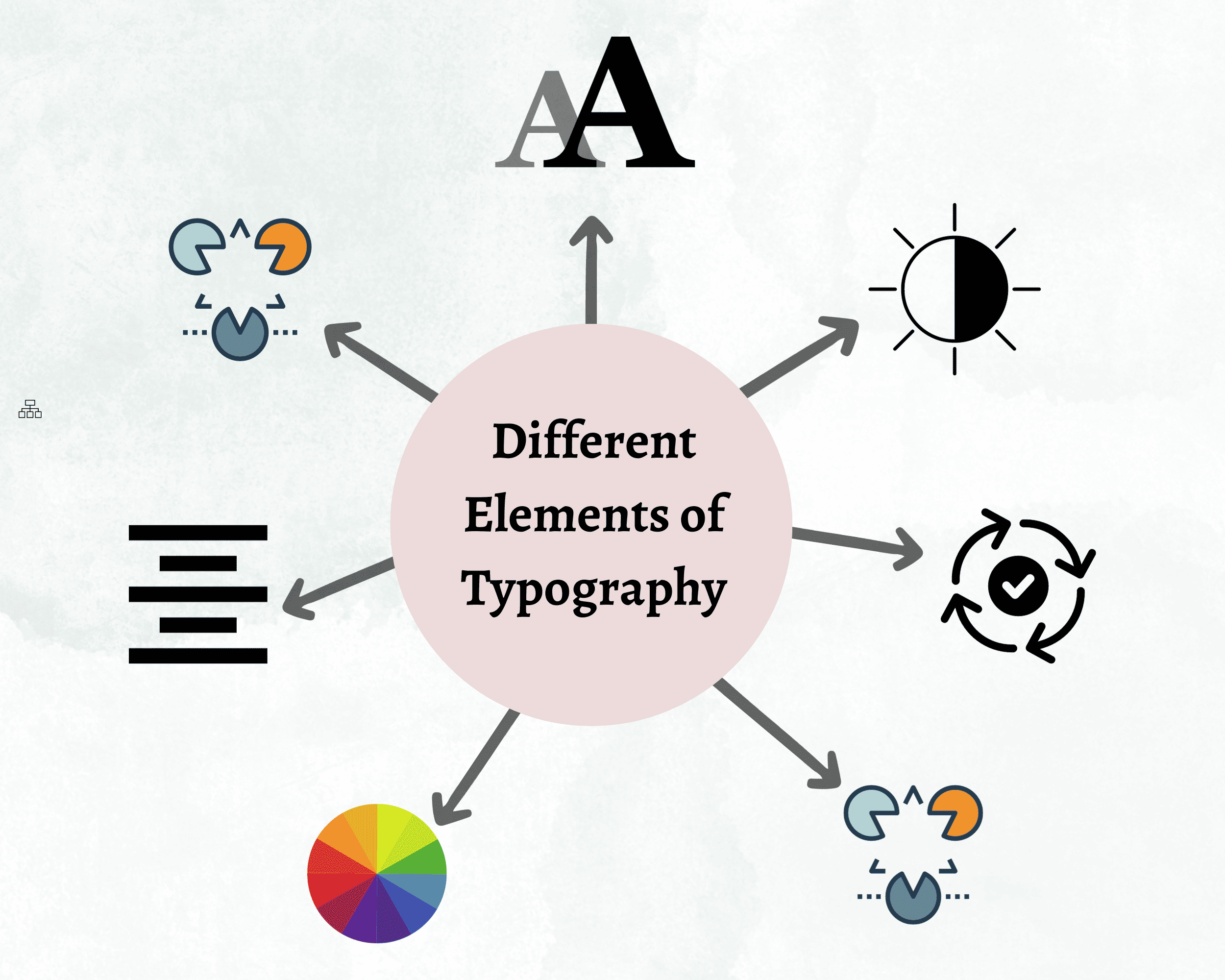
Different Elements of Typography
Before starting on typography, it is crucial that you first need a firm grasp of the diverse elements of typography, such as:

1. Fonts and Typefaces
The majority of people often think that font and typeface are similar, but there is a difference between both of them.
A typeface is a design style that comprises many characters of varying weights and sizes. It can be referred to as creating the text style.
A font refers to the weights, widths, and style of a typeface and is a graphical representation of text characters.
Simply put, a related font’s family is a typeface, while fonts include weight, width, and style that constitute a typeface. There are three basic kinds of typefaces:
-
Serif
These are the conventional and old-fashioned typefaces most preferably used by web developers or designers. One can identify Serif by the extra mark at the end of the letters. These are helpful in improving the readability of text by providing visual cues. Often, Serif fonts are utilized for body text as these are easier to read on the screen.
-
Sans-Serif
These are more modern and bold typefaces. These are more clarified by their name as without serif (the extra mark or the traditional strokes at the end of the letters). This makes it clear to read and attention-grabbing when used in headings.
-
Decorative
These typefaces are used to bring a more aesthetic look to the text. As a result, decorative typefaces are more often used for brand logos, short titles, names, and so on.
2. Contrast
One of the essential elements of typography is contrast. It is helpful in making the text attention-grabbing and interesting. You can spend time with a responsive web developer in contrast to convey your brand message more meaningfully and in a clear way.
3. Consistency
Consistency is key to avoid a cluttered and confusing interface. This makes it essential to stick to the same font style throughout your website. It helps a reader to understand the information you are about to convey to them.
4. Whitespace
Whitespace is often referred to as “negative space” around the text and graphics. This practice is often overlooked, and tend that users won’t notice it. But to make text and graphics more readable and understandable, negative spacing plays a vital role.
Also, it is helpful in drawing a user’s attention towards the text by providing a more pleasing and aesthetic look to your website.
5. Alignment
It is the process of composing text and graphics in a unifying way to ensure equal size and space between each element. Web designers create margins to ensure the header, body, and logo of the text are aligned with each other.
6. Color
Color is one of the exciting elements of web typography. The color of text is vital, and you do not have to take it lightly. Your font color can help the text of your website differentiate from the competition and convey the message more clearly.
7. Hierarchy
A typographical hierarchy is essential in establishing a more readable look to the text. It is helpful in bringing the prominent pieces of the copy that should be noticed and read at first. Without the proper hierarchy, every letter on the web would look the same.
How to Choose the Right Typeface for Your Website?
It is important to choose the right typeface for your website to attain the user’s eye. Ideally, opting for the right typeface for your website is a lot harder than you think. While selecting one, you have to consider a few considerations.
1. It Should Reflect Brand Identity
You should choose the typeface for your website, which involves aligning it with your brand. It should convey the essence and reflect the value of your brand. This ensures a united user experience that sticks with your audience.
2. Consistency is the key
Did you know that typographical consistency is the key to building a solid brand identity? This contains everything from the color schemes for your website to the typeface you choose. Therefore, maintaining a consistent typeface throughout your website shows professionalism and helps users navigate your website.
3. Pay Focus on Readability
You should ensure the readability of the content of your website while selecting the typeface for your website. Select the fonts that are easy to understand and can work across various devices. Focus on using proper spacing and font size helpful in enhancing the reading experience of users.
4. Consider Performance
Inappropriate usage of fonts may affect the load time of your website. Hence, consider the performance of the chosen typeface You should select the web-friendly fonts that strike a balance between the look and performance of your website. This ensures a smooth and efficient user experience.
5. Do not skip Function
Different sections of your website, including headers, body text, and calls-to-action, might require distinct typefaces. Hence, tailoring the typeface to each function optimizes visual hierarchy and user engagement.
6. Two or Three Fonts are Maximum
Limit the number of fonts to maintain visual coherence. Using two or three fonts at most helps avoid clutter and confusion. A well-chosen combination enhances design aesthetics without overwhelming the viewer.
7. Do Not forget Font Pairing
Carefully pair fonts that complement each other. Choose fonts with contrasting styles (serif and sans-serif, for example) to create visual interest while maintaining a balanced and cohesive overall design.
8. Pick Web Safe Fonts
Opt for web-safe fonts to ensure consistent rendering across various browsers and devices. This prevents potential compatibility issues, guaranteeing that your chosen typefaces will display as intended for all users.
Conclusion
With the right set of typography practices, you can enhance the user experience of your website. This can significantly improve the accessibility of the text to improve its readability. It also impacts the way users engage with the content.
However, sometimes, it can be overlooked by a business because of the various tasks that a business has to handle. As an experienced website development company, we will help you ensure that every vital element of the typography is well-aligned with your project.


