Mobile Vs Desktop Website: There is a huge difference between the experience one can get when browsing a website on mobile instead of desktop. It is obvious that mobile is surpassing the traditional desktop versions when we will observe the relevant time spent while browsing the web. In parallel, better user experience is the need of the hour which is easily noticed in mobile websites with a rather less impact to its desktop counterpart.
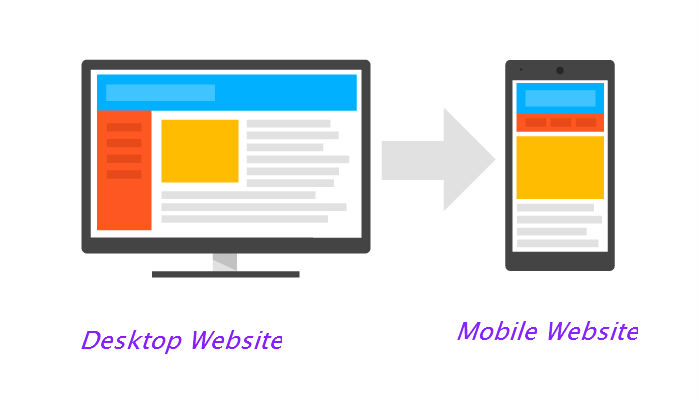
When it comes to discussing the steps one can take to get improved UX, you do not necessarily need to translate the duplicate UX design blueprint of the equivalent desktop version. Users tend to behave differently when they access a website through mobile. This is the reason various web components are designed and developed separately to cater to the specific mobile user requirements.
There are many aspects that can help to understand how the mobile browsing feel is distinct from desktop browsing. Once you comprehend these distinctions, you can make a wise decision in between mobile vs desktop website about how you can improvise your brand website in a furnished way.
Read the below pointers to understand the same-
Screen Orientation Mobile Vs Desktop Website
Screen orientation is the key factor that affects the designing flow of the desktop and mobile version of a website. The desktop view has a wide screen that favors landscape-oriented design to showcase the content beautifully.
Wherein, the portrait orientation allows content to fit in the narrow screen. It means that horizontally arranged data is the best suitable for the desktop users instead of mobile users for whom it is troublesome to navigate horizontally in a mobile website.
For the mobile users, vertical data flow is best preferred as it is compatible with the direction in which screen scroll is made.
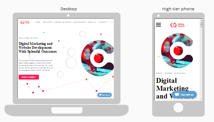
Webby Central is the best example to illustrate exact use of the above concept.
Touch Experience
The website interaction is made simpler with a mouse or cursor because the cursor enables easy navigation of the site. In contrast, the mobile websites only demand tapping on the small screen for any navigation.
In few instances, users might click a wrong link or button because of a small size of the buttons which is tough to manage with a finger. Considering this crucial issue, UX design experts need to create critical web interface elements such as call-to-action buttons, menu buttons and other navigational links that are big enough for easy tapping.
Content Requirement
Content is always dominating no matter which device you are using. But, there is a specific criterion for which element to be kept on priority. For the desktop version, you can provide more content per page. Wherein, a mobile website does not stock much content and allows effective arrangement of content elements.
There are so many considerations like:
- Screen limitation
- User mobile behavior, and
- User’s mobility
which demands to shorten word count to fit the screen.
Trip Advisor is one of the best examples of a website which require good organization of the content elements when viewed through mobile.
Menu Formatting
The menu format creates a big difference between mobile and desktop. If we move technically, desktop view has mega-menus with multiple categories and sub-categories. This makes it easy to read the text and click on the text links over the big screens.
On the other side of the coin, mobile view has small screens with a relatively large thumbs. Here, the menus collapse and then expand as a user narrows within a category.
Contact Form
Web forms are the greatest source of conversion and this is the reason they need to be designed well. The same applies to the mobile users to fill the form while few things are kept in mind-
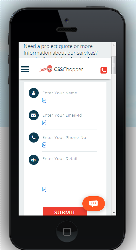
- The first and foremost aspect is vertical alignment because it is tough for the mobile audience to scroll back and worth horizontally while filling the form. CSSChopper is a nice example to illustrate exact use of the above concept.


- Predictive text is yet another useful option you can embed into your mobile website so that the users can move the form quickly. This reduces the chances of typos that commonly occurs while typing on a small screen.
This can be seen on Kayak while a user is doing a flight search.
- Less number of fields is also an appreciable fact that you can accomplish by asking the users only for that information which is indispensable to complete the transaction.
Likewise, you should use a single field of entry by condensing multiple fields into one. This is because mobile users might get annoyed to jump within a large number of fields.
Covering It Up
As the technology is moving really fast, it is vital for the businesses to use a full-fledged website. As per your requirements, you can thoroughly scrutinize to make a profitable decision about mobile Vs desktop website version works well for you. The list of factors mentioned in this post are meant to help the business owners in maintaining a supreme quality website.
Tags
Categories
Recent Posts
Popular Posts
- How to Choose a Reliable Offshore Development Partner?
- Transforming Web Development with HTMX’s Declarative Approach for Dynamic UIs
- Why Your Conversion Funnel Needs a Composable Commerce Solution?
- How to Outsource Web Development in 2025: Complete Guide
- What are the Top Web Development Trends for 2025?

